Client
web development
Portland Streetcar, Inc.
oof
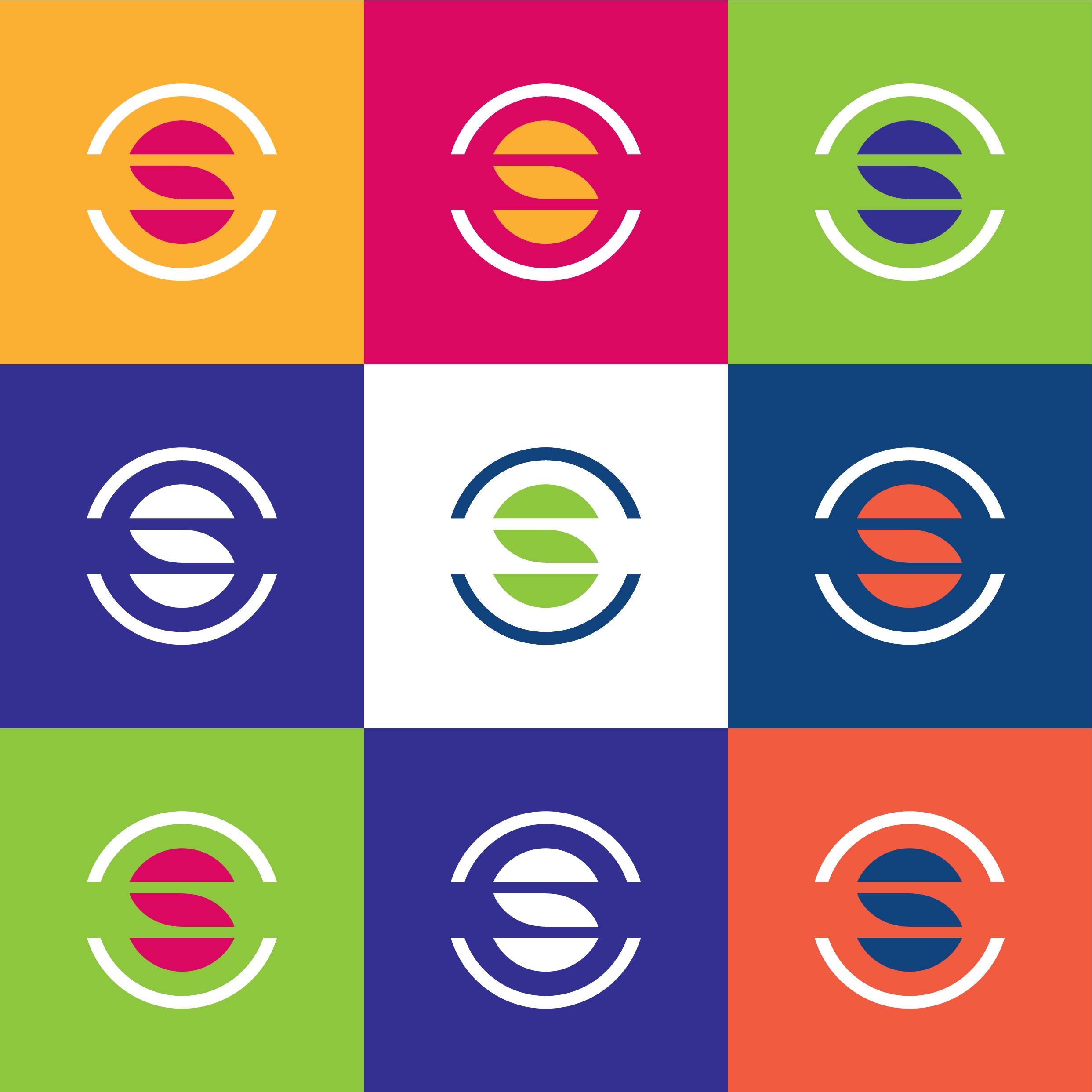
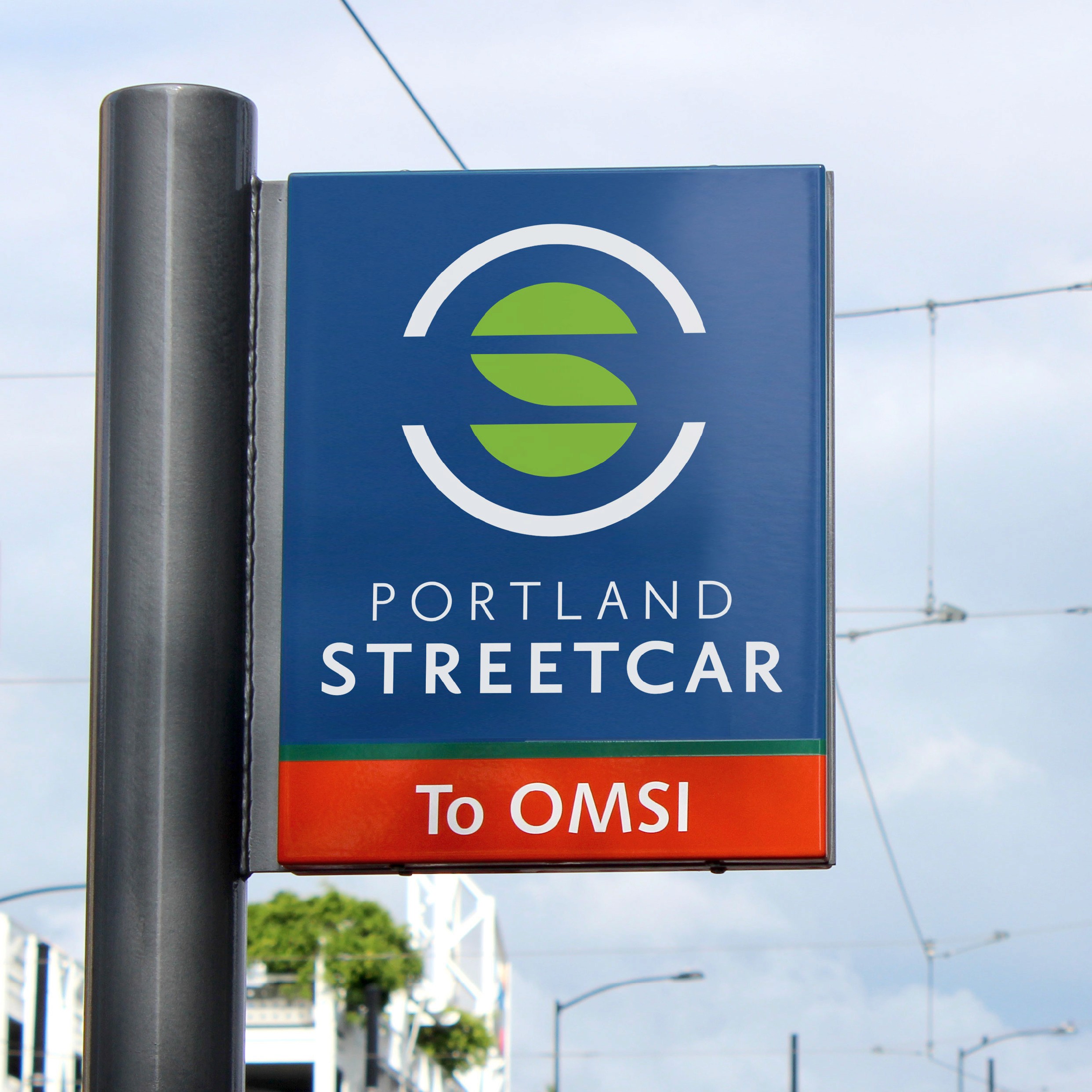
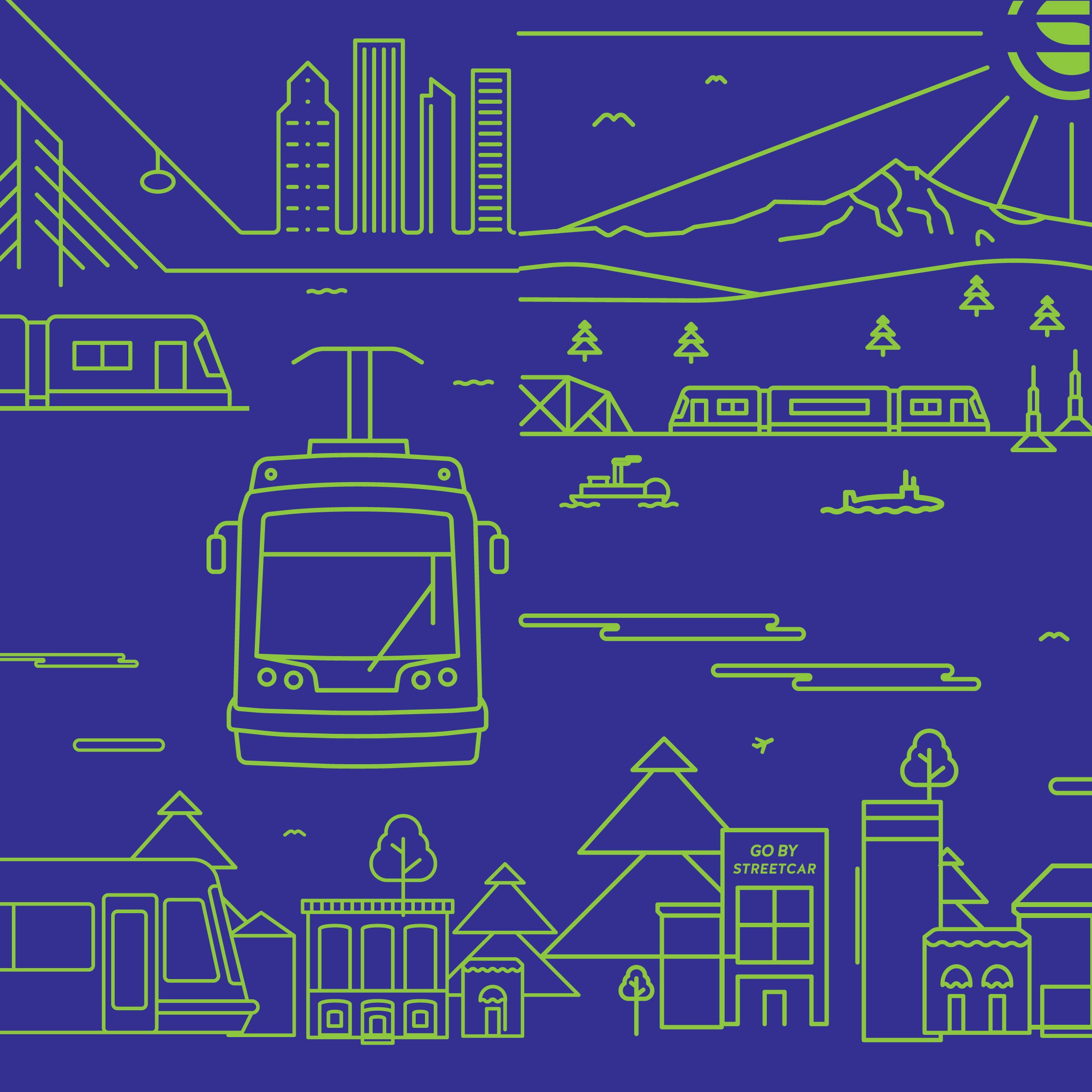
The new logo evokes the “S” of Streetcar, its rails, the bridges it crosses, and the two halves of the city coming together. Since our research showed the colors of the iconic cars were a popular and essential part of the look, we made sure to keep the palette intact and let it shine to its full effect.
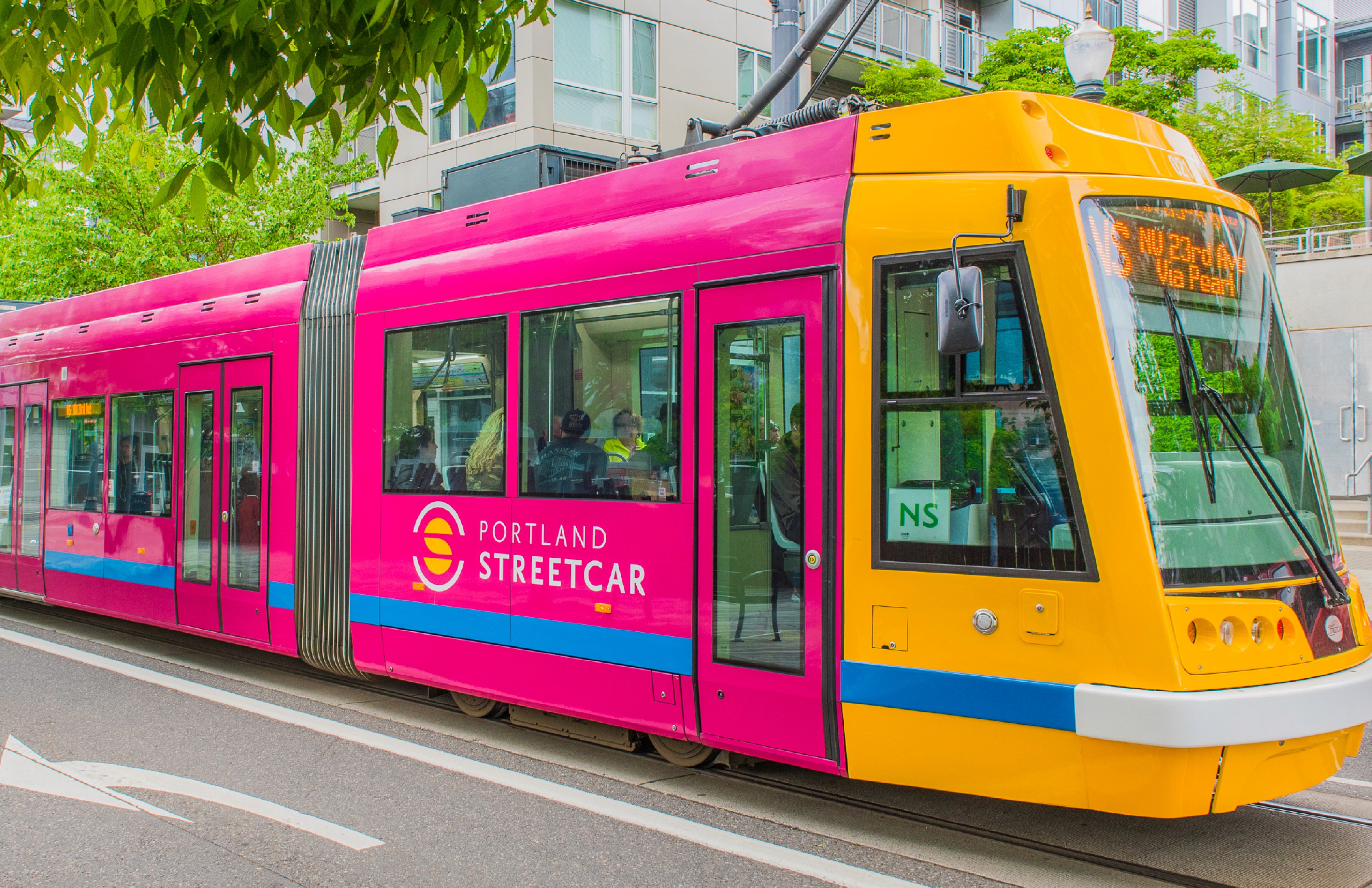
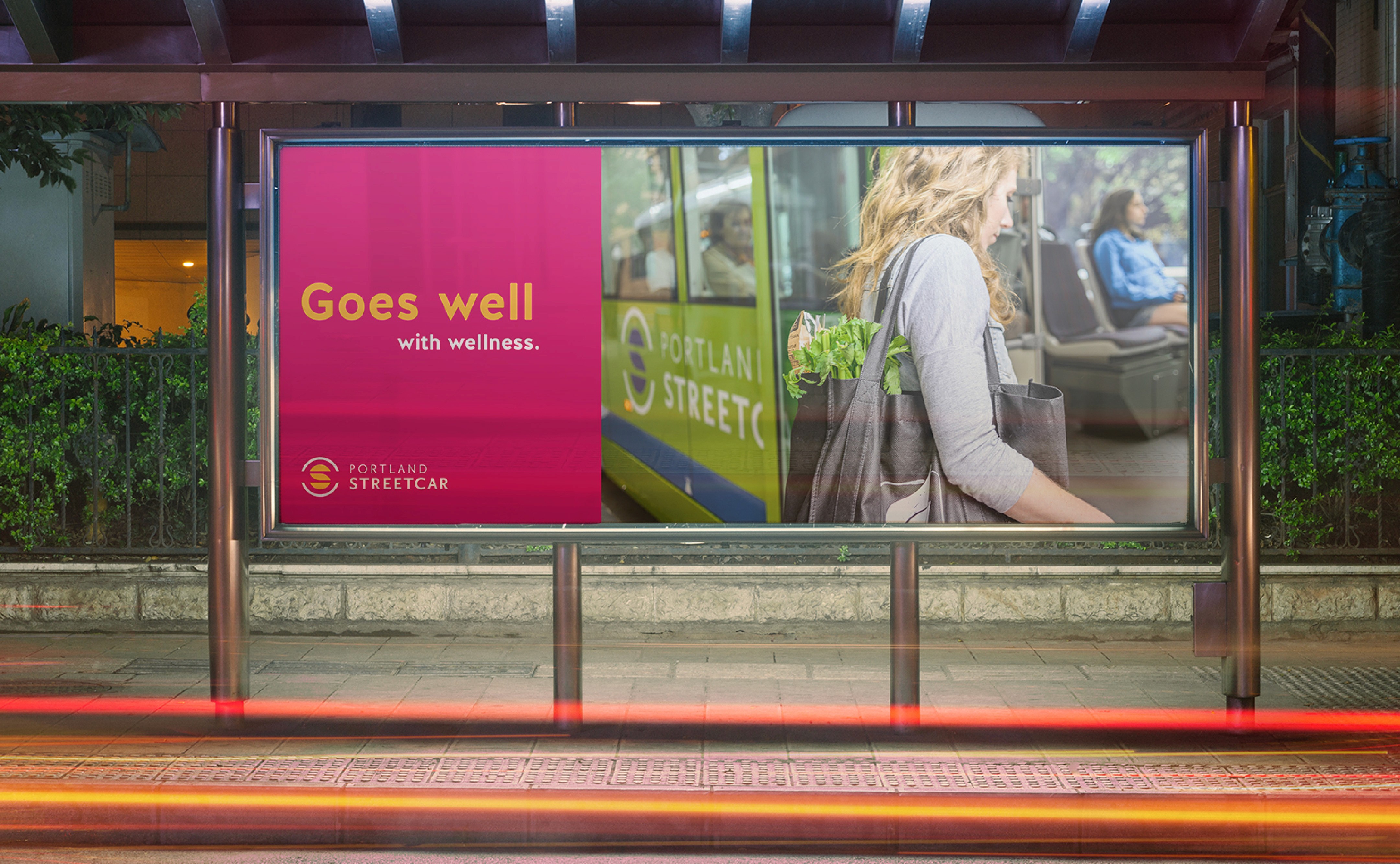
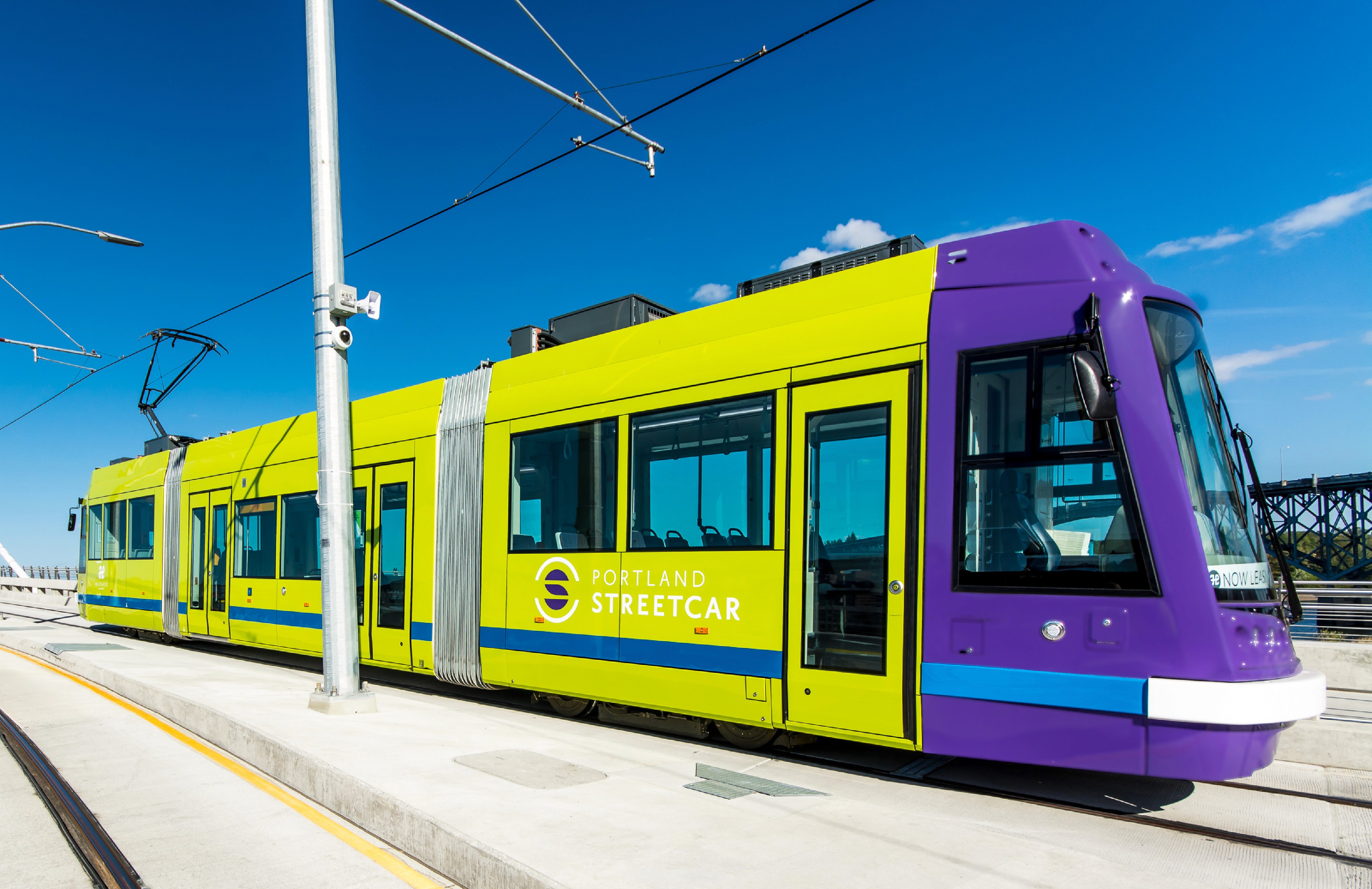
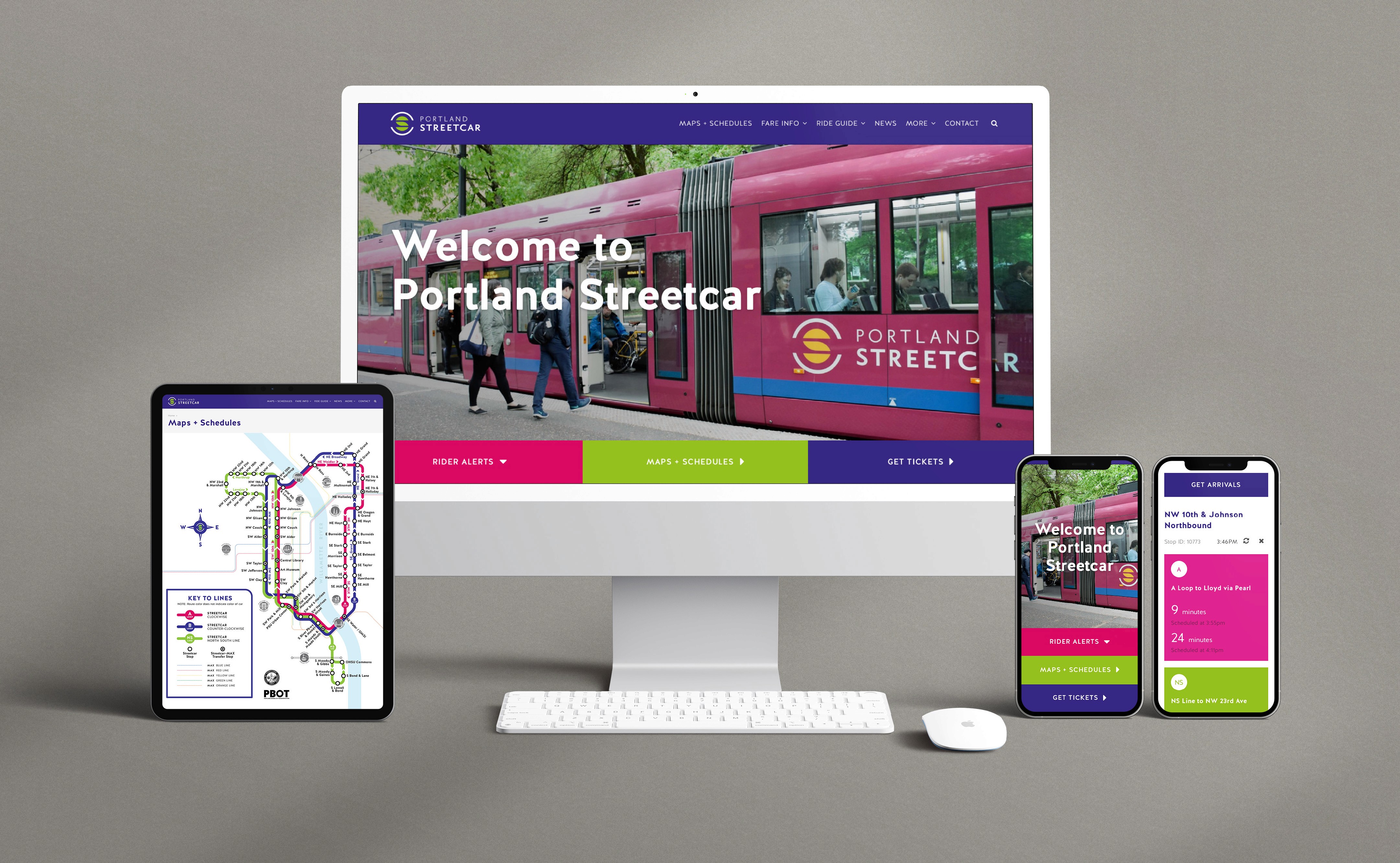
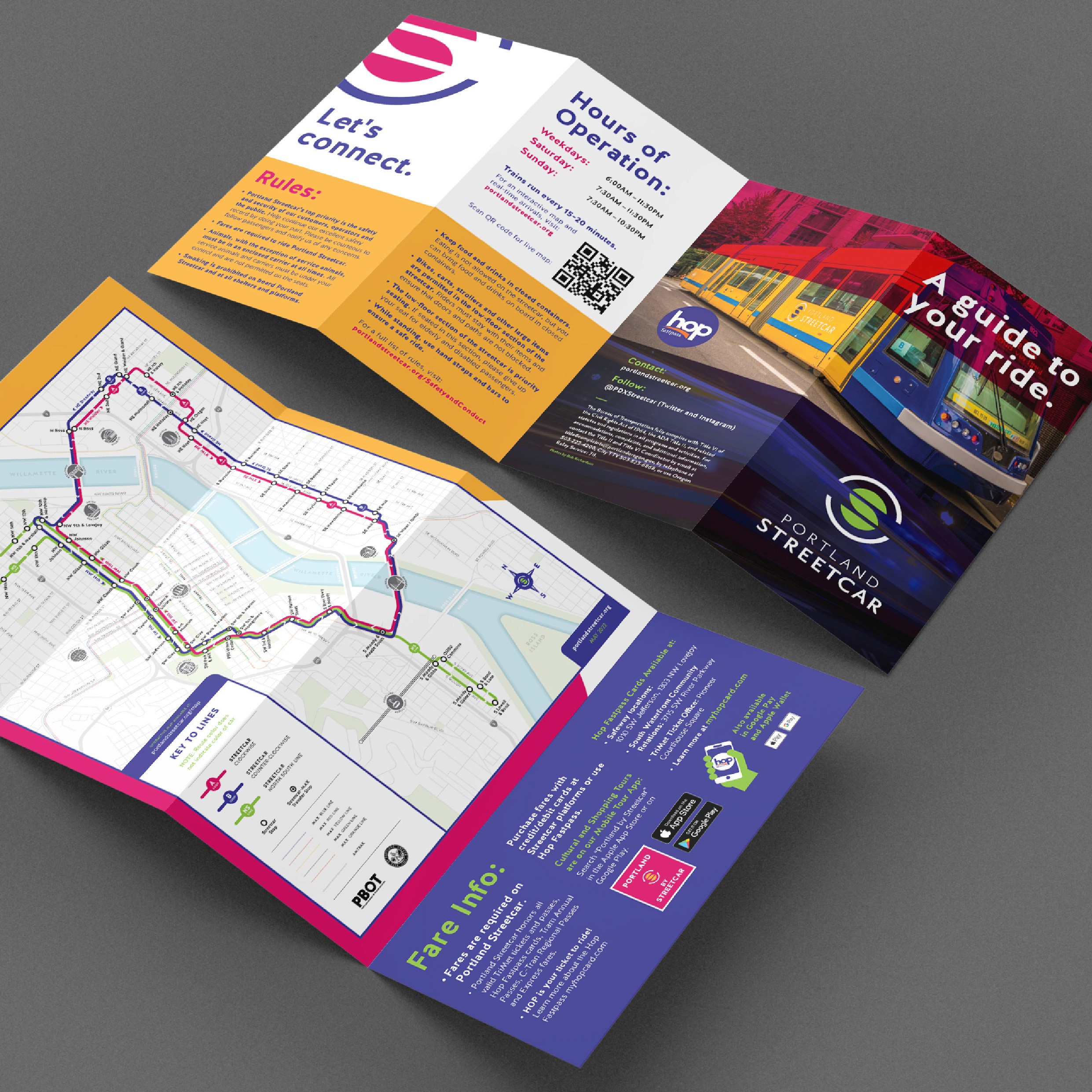
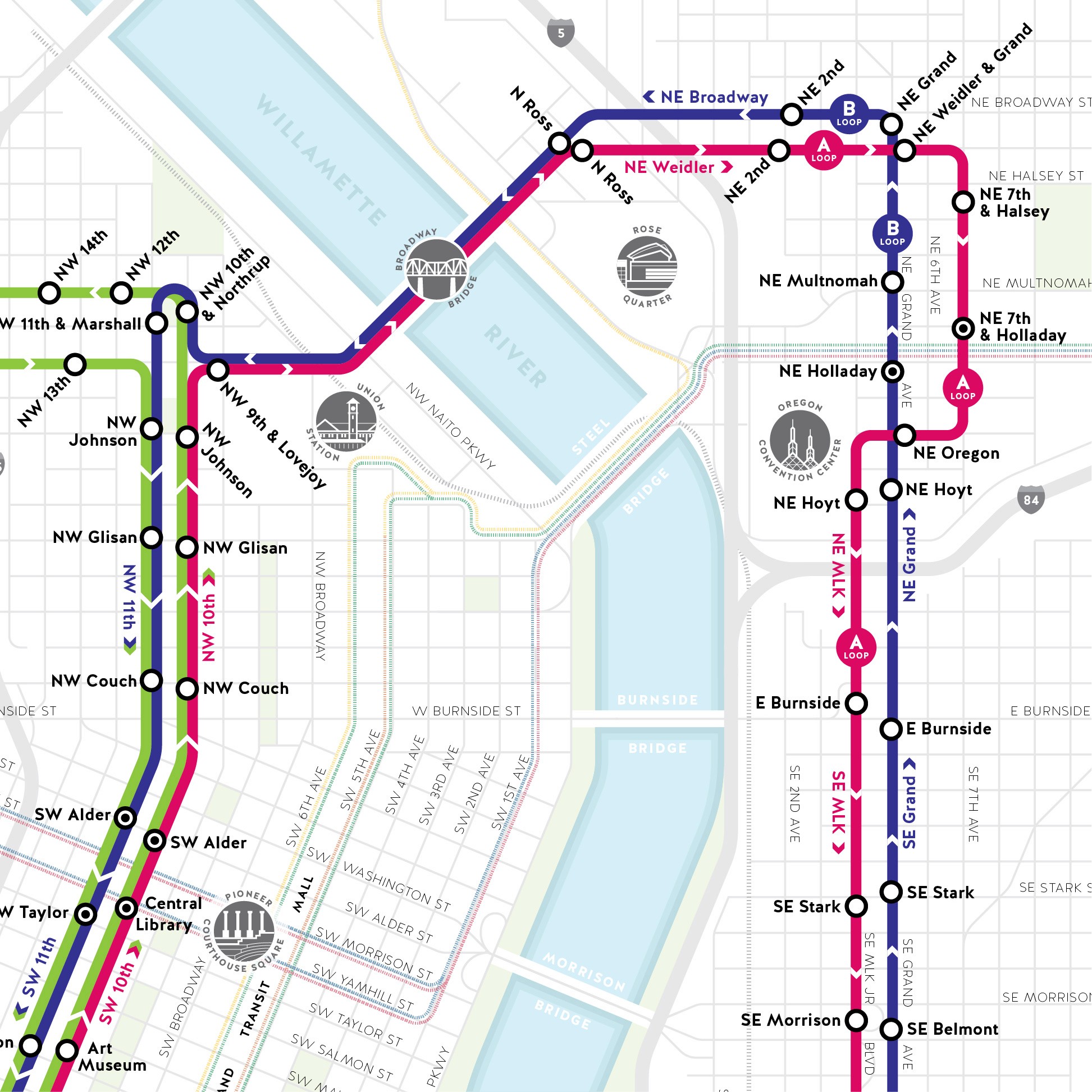
The new brand’s bold visual language paired well with extensively streamlined rider interactions and information organization. The central brand story and promise focused on appealing to a broad audience of policy makers, politicians and developers, as well as riders and non-riders alike. The results are as easy and fun to navigate as the Streetcar itself.
